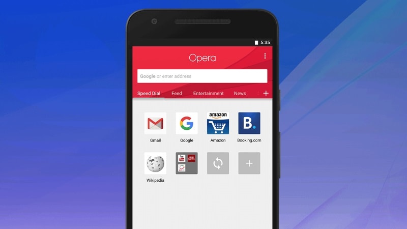
Opera browser on Android has received a user interface makeover inspired by Android’s Material Design with its latest update. Opera says that the new design on the browser is ‘fresh’ and ‘modern’.
You will find the Speed Dial on the left of the carousel on the newly designed start page while the news feed will be on the right side of the page. “Scroll through the channels across the top to see your favourite topics, and tap the + icon on the right to configure your favourite topics: you can easily add and remove them to customize the news you get,” the company said in its blog.
The news feed will also be available with a reader mode that will allow your articles to load more quickly. You will be able to get access to offline pages, bookmarks, history and downloads by tapping on the ‘person icon’ in the bottom-right corner. “You can also sign in here to sync your Speed Dial, bookmarks, tabs and typed history across your devices,” Opera said.
By tapping on the three dots on the top-right corner of the screen, you can access options “find in page” and “share”. You also get to enable ‘data savings’ feature from this menu.
The Opera for Android update will be rolling out through Google Play and should be available soon to all users.
Opera says that it is currently working on the options to switch between tablet and normal layouts, change the news feed language, and select your download folder of choice.
[Source:- gadgets.ndtv]


