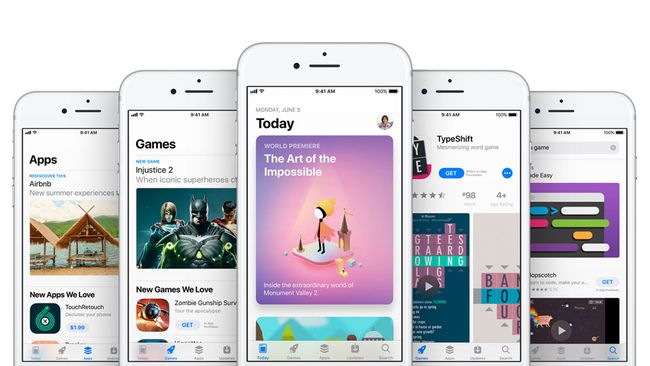
Your eyes might roll on hearing the tired old phrase ‘there’s an app for that’, but apps on the iPhone have been a revolution. Sure, older phones had their own app stores, but they were fragmented affairs, full of mediocre products that were fiddly to use.
The iPhone’s hardware smarts combined with eager developers and a great SDK resulted in a string of innovative apps that continues to this day.
As we await the coming of the iPhone X, in this list, we select ten apps we believe defined the iPhone. They may not necessarily be the best apps on the platform – TechRadar has its best free iPhone apps and best iPhone apps lists for that. But each of them was instrumental in making the iPhone a vital device to own, and influencing a slew of other products across the smartphone space.
Safari (2007)
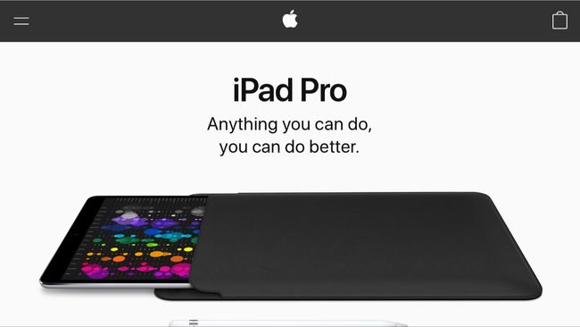
When the iPhone was revealed, Steve Jobs called the web browsing experience on rival devices “the baby internet”. He was right – and it’s easy to forget how awful going online with a phone used to be.
Safari changed everything. There was no WAP. This wasn’t a cut-back internet. It *was* the internet. (Apart from Flash, which Apple decided not to support; Adobe finally threw in the towel earlier this year.)
Moreover, using Safari was fun, the iPhone’s gestural controls providing a fluidity and intimacy simply not possible with a PC and a mouse.
Facebook (2008)
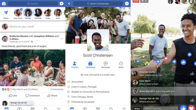
Prior to the App Store’s arrival, Facebook had already cottoned on to the transformative effect of smartphones, creating a mobile-optimized version of its website. But the Facebook app for iPhone accelerated the migration of social network users from PCs to smartphones.
Keeping in touch, chatting with friends, and scrolling through news made more sense on a device you had on you at all times, and that could be used anywhere. The floodgates duly opened, everyone else swiftly followed suit.
Brushes (2008)
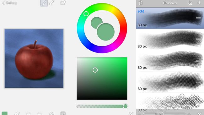
Cell phones had always been utilitarian devices. But the App Store – and Apple’s history at the intersection of technology and the arts – made some developers think differently. With Brushes, Steve Sprang created a fully touch-based painting app optimized for the iPhone’s smallish screen.
Detractors still howled that iPhones were for consumption, not creativity. That argument was put to rest with the June 1, 2009 issue of The New Yorker, painted by Jorge Colombo while he stood outside of Madame Tussaud’s in Time Square.
The original Brushes is sadly long gone, but the app lives on as the free Brushes Redux.
Runkeeper (2008)
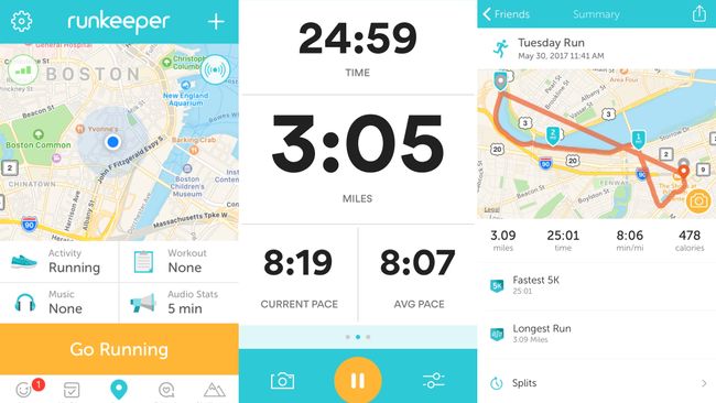
Now one of mobile’s most famous exercise brands, Runkeeper was originally a punt. Everyone knew the App Store was on the way, but the creators of the Runkeeper app took the calculated risk the iPhone 3G would work with GPS – as opposed to using the Wi-Fi triangulation positioning method found in the original iPhone.
The app was a success, enabling people to track runs without the need for bespoke hardware (or so-called shoe hacks). It all just worked, even enabling you to peruse a map of your route when you were done. This might seem obvious in our current era of countless wearables, but in 2008, Runkeeper was a revelation.
Ocarina (2008)
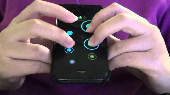
One of the benefits of iPhone, as envisaged by Apple, was that in removing the keyboard, the device ‘became’ the app it was running. Ocarina went all-in on this concept, transforming your iPhone into a high-tech wind instrument played by pressing virtual keys and blowing into the microphone.
Ocarina’s time in the sun was short, but the app showcased the ‘disappearance’ of the device like nothing else had before. And on the trail it blazed, creatively integrating an iPhone’s sensors, flexibility, and handheld nature, many games and apps subsequently followed.
Instagram (2010)
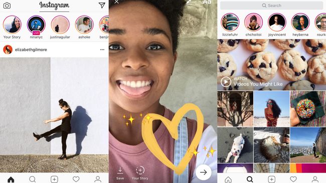
Early iPhone cameras weren’t great, but they were popular – the world was coming round to Chase Jarvis’s argument that the “best camera is the one that’s with you”. But something else was also happening at the turn of the decade, with companies recognizing photography becoming a social pursuit.
Instagram was the app that nailed this shift, through a combination of immediacy, filters that made even the most bodged shot look interesting, and sharing capabilities that could potentially make any photo go viral. Ever since, digital photography and social networks have for millions of people been inextricably intertwined.
Snapchat (2011)
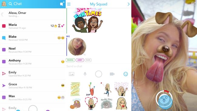
From the start, Snapchat has been an app you either get or you don’t. It’s messy. It’s not about the edit, instead urging you to share anything and everything that’s going on. Youngsters can use and browse the app at such speed as to dizzy older folk, sending them scurrying back to the warm embrace of fuddy-duddy Facebook.
But that differentiator is key and what makes Snapchat so important. It points to the future, noting everything doesn’t have to be (and in fact *cannot* be) the same. And it promotes fun and immediacy over worrying whether that snap of your lunch is perfectly arranged with the most appropriate filter.
GarageBand (2011)
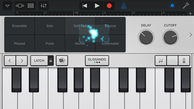
On desktop, GarageBand was an impressive app – an entry-level music-studio environment that nonetheless contained a surprising amount of power for those who needed it. On iPhone, it showcased an astonishing level of ambition.
In the palm of your hand, GarageBand gave you multitrack recording, ‘smart’ instruments so anyone could make a song, professional-sounding stomp boxes for guitarists, and more synths than you could shake a stick at.
Perhaps more than any other Apple app, GarageBand pushed app creators to think bigger regarding iPhone, and to realize almost any desktop app could be reworked for mobile if done so with the utmost care.
Google Maps (2012)
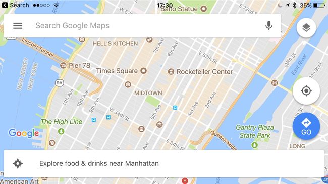
Those involved with the iPhone during its creation say maps were an eleventh-hour addition, involving a ‘hastily’ arranged deal with Google for mapping data. This smart move ensured people with iPhones could find their way around, and began the rapid decline of car sat-navs.
But Apple’s increasingly fractious relationship with Google resulted in the latter’s data being replaced by Apple’s in iOS 6. It didn’t go well, and Tim Cook publicly apologized for the flawed launch. Meanwhile, Google eventually released its own first-party Google Maps app, as part of its ‘platform on a platform’ strategy. To this day, it in key areas betters Apple’s own Maps.
Tinder (2012)
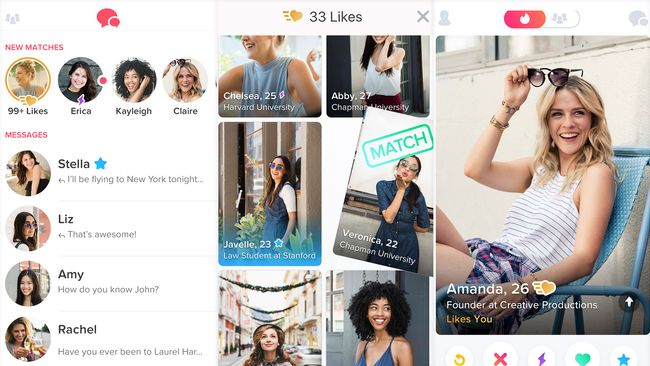
The genius behind Tinder wasn’t in being a dating app for iPhone – although the platform was part of it. After all, a dating app seems more suited to a small screen that affords you a level of intimacy, rather than the relative acres found on a laptop or desktop. Mostly, though, Tinder‘s smarts were all about design.
Instead of having you scour the minutiae of profiles, Tinder streamlines choosing potential partners to ‘swipe right to like’. This ease of use was key in helping Tinder quickly become the go-to dating app for an entire generation. Well, at least the bit of that generation armed with a smartphone. If you were still sporting an original Nokia 3310, you had to do it the old-fashioned way.
[“Source-techradar”]


