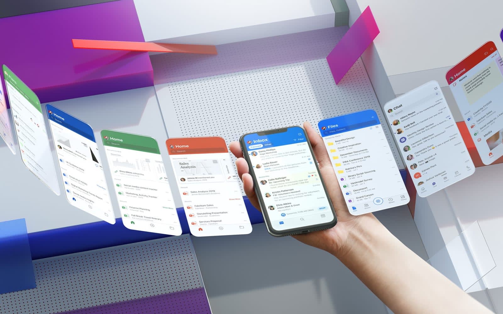
Microsoft just unveiled redesigned versions of its Outlook, OneDrive, Word, Excel and PowerPoint mobile apps. Designed with Microsoft’s Fluent Design system, the changes are meant to “take mobile productivity to the next level,” Microsoft wrote in a blog post.
The apps now have a more consistent visual design, which includes new app icons, splash screens, cards, typography and more. Productivity features like Play My Emails will let users listen to their inbox as if it were a podcast, and Read Aloud will serve a similar function in Word and Office apps. You can also use your phone to quickly scan documents and tables to Office, OneDrive and other apps.
Microsoft recognized that despite users spending up to four hours per day on their phones, each session averages just 20 to 30 seconds. So, the company asked how it could cram more productivity into the quick glances users take at their phones.
“While on the go, we often switch between apps and have shorter attention spans, sharper time constraints, or are in more distracting environments,” Microsoft wrote. “When mobile apps seamlessly connect and feel similar, it reduces cognitive burden by eliminating the need to re-learn app patterns and navigation.”
Microsoft says redesigned versions of Teams, Yammer and Planner are on their way, and it is sharing new mobile UI toolkits with third-party app developers, so other apps can embrace similar design elements and productivity focus.
[“source=engadget”]


